Waypoints
Private app, in useA private, two-person travel tracker built around a single constraint: the data has to outlive the software by forty years.
What it is
Waypoints is a travel tracker my partner and I use for two things: remembering where we’ve been, and planning where we’re going next. It’s one app with three views (a map, a list of trips, and a list of locations), and everything in it hangs off two ideas.
A location is a place: a city, a region, or a point on a map. It carries tags explaining why it’s interesting (food, wine, hiking), freeform notes, and a note about how you’d likely get there (a direct visit, part of a land tour, or a cruise stop). A location doesn’t need to belong to a trip. Half of them are just ideas.
A trip is an ordered series of stops across a date range, either already taken or planned, with the people who came along. Each stop can carry its own arrival and departure dates and its own notes.
Everything else in the app falls out of those two things.
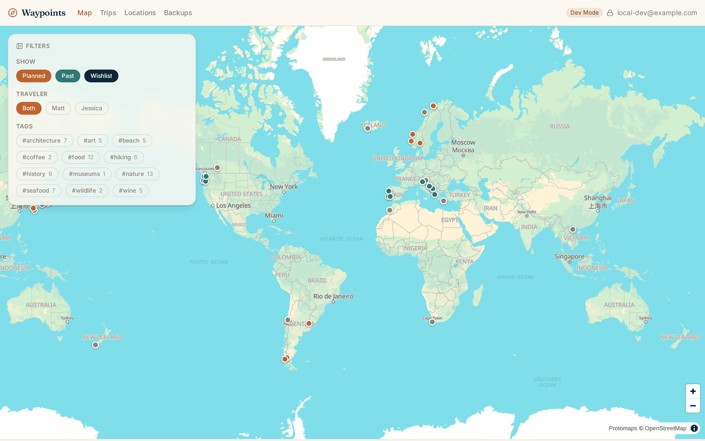
The map, with everything visible: planned trips in terracotta, past trips in teal, and unbooked wishlist locations in gray. The filter panel is translucent so the map keeps reading as one surface.
The constraint that shaped everything
The original requirement wasn’t “build a travel app.” It was: only the data needs to survive 40 to 50 years.
That’s a much longer horizon than any part of today’s stack should be trusted with. None of it is a safe fifty-year bet: not Cloudflare, not D1, not React Router, not the deployment model, not my own continuing interest in maintaining it. Our travel history is.
So the application is explicitly treated as disposable. It can be rewritten, replaced, or abandoned, probably more than once. What can’t be lost is the content. The mechanism is boring on purpose: a full snapshot of every person, tag, location, trip, and stop, written to object storage on a daily schedule and on demand, in a documented format with a version number and a change history.
JSON isn’t the format because it was the convenient default. It’s the format because it degrades well. If “JSON” is an archaic term by the time anyone needs this (the way “WordPerfect file” or “Hypercard stack” reads now), the file still explains itself: nested keys and values in plain text, reverse-engineerable by looking at it, with no library, no schema registry, and no surviving vendor required. That’s a lower bar than “a parser still exists,” and it’s the bar that matters at this range.

The Backups page lists every snapshot with a download link, plus an “Export now” button. The daily one runs on a cron trigger at 14:00 UTC.
The repo carries that discipline as a rule rather than a good intention: any change to the data model has to update the export schema document and bump its version in the same commit. The schema doc, not the code, is the thing a future rebuild depends on.
The same reasoning explains the other document in the repo: a stack-independent specification describing the domain model, every feature, and the design system in plain English, written so it stays true even if the app is rebuilt in a framework nobody has invented yet. If the app gets thrown away and rewritten several times across the next few decades, something has to carry the intent across each rewrite, and it can’t be the code. I have no confidence that in thirty years some tool (a Claude instance, whatever succeeds it, or a person with a free weekend) will reliably reconstruct what a feature was supposed to do from a React Router codebase of that vintage. I have reasonable confidence that English won’t have drifted far enough to make a specification unreadable. So the spec is written as a durable artifact in its own right, kept current with the app as a rule, and treated as the thing that survives alongside the data.
None of this is advice for normal software. It’s a set of tradeoffs that only makes sense on a timescale most applications never have to think about, and it costs real effort that would be waste almost anywhere else.
The map is the product
Trips and locations are lists. The map is the reason the app exists.
Pins are colored by status: terracotta for planned, teal for past, quiet gray for a wishlist idea that isn’t a real trip yet. Filters narrow by trip status, by traveler, and by tag, and only tags that some location actually carries are offered, each with a count. That last detail sounds fussy until you realize tags get created as a side effect of saving a location and never deleted, so without it the filter list slowly fills with orphans that can only ever produce an empty map.
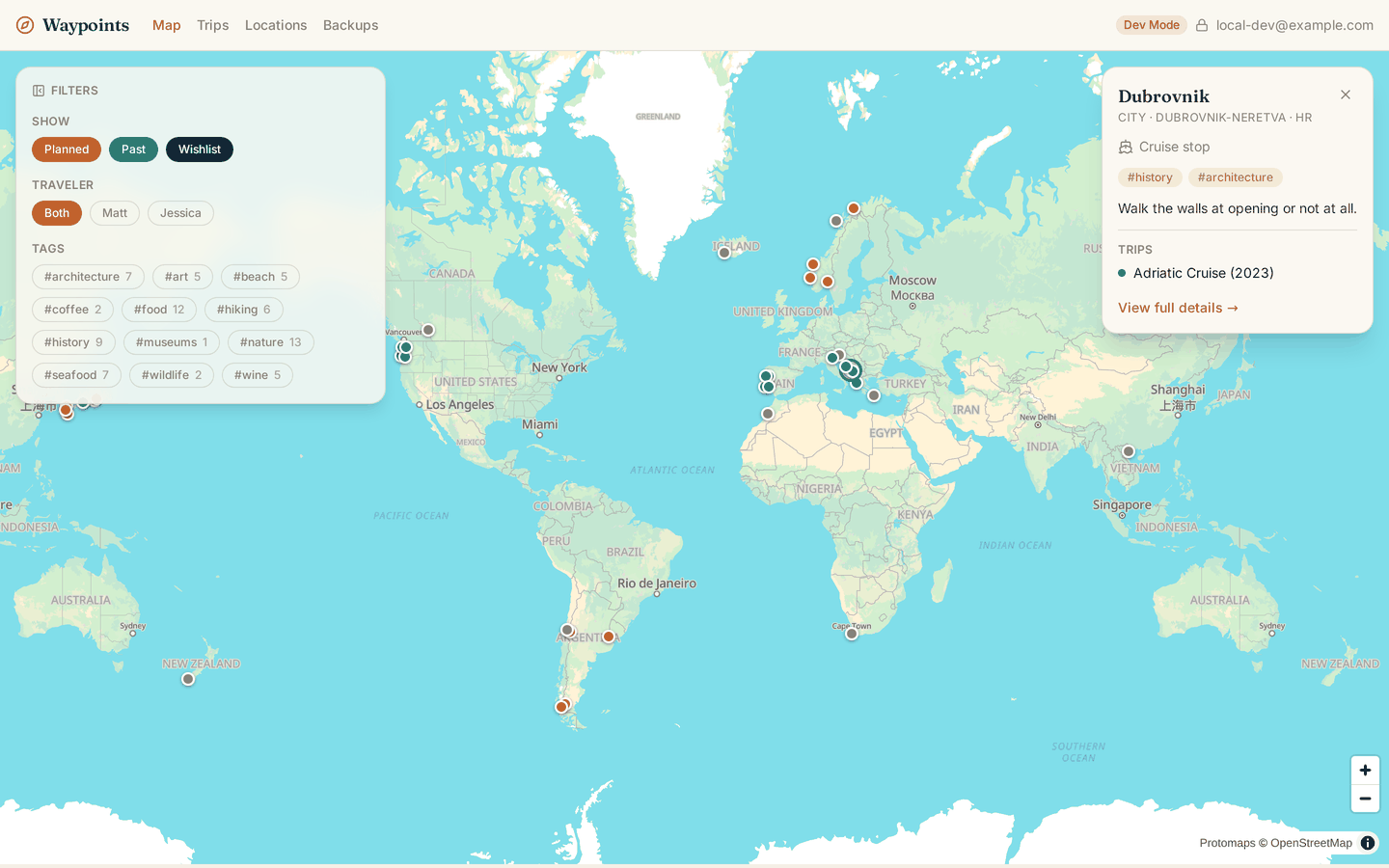
Clicking a pin slides in a detail panel instead of navigating away, showing name, region, visit style, tags, notes, and the trips that stop there.
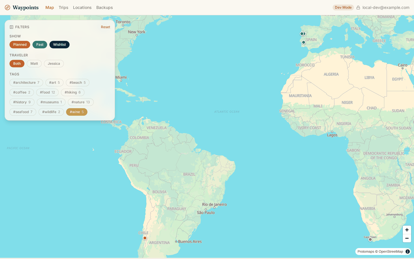
Filtering to #wine refits the map to just the matching pins, and pads the fit around the filter panel so that filtering never hides its own results underneath the controls. A “Reset” appears as soon as any filter is off-default.
A few of the map’s decisions came out of actually using it rather than designing it:
- Pins render before tiles. Markers are plain DOM elements, not part of the map style, so they appear and respond to clicks while the basemap is still downloading. The app is for two people who use it on hotel wifi and airport LTE; an empty map with no pins for six seconds is the failure case that matters.
- Pins at identical coordinates fan apart by a fixed on-screen distance, so a city visited on two different trips doesn’t read as one pin.
- Touch targets are bigger than the pins. The visible dot is 14px; the button around it is a fingertip.
- The filter panel collapses, starting collapsed on phones and expanded on larger screens, with a badge counting active filters so a collapsed panel can’t silently hide why the map looks empty.
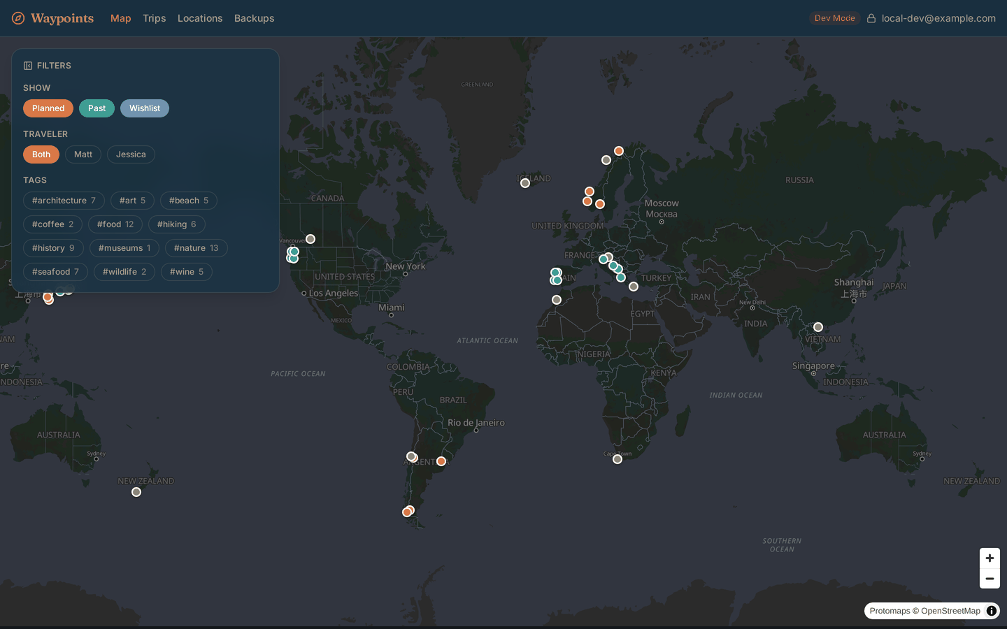
Dark mode brightens the accent colors on a near-black base rather than reassigning what they mean.
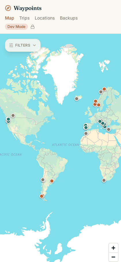
On a phone the filter panel collapses to one control and the header drops the email address (it’s the widest thing up there) while keeping the lock icon that signals the site is authenticated.
Trips, stops, and the parts that only show up in real use
Trips are grouped into Planned and Past, rendered as “passport stamp” cards with a colored accent bar.
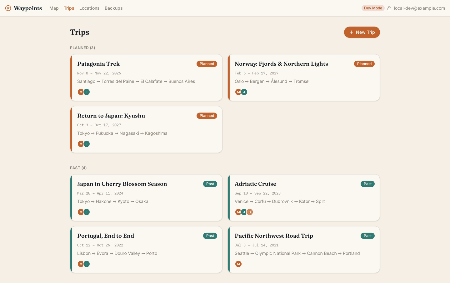
Trip cards show the date range, the stop sequence, and a dot per traveler.
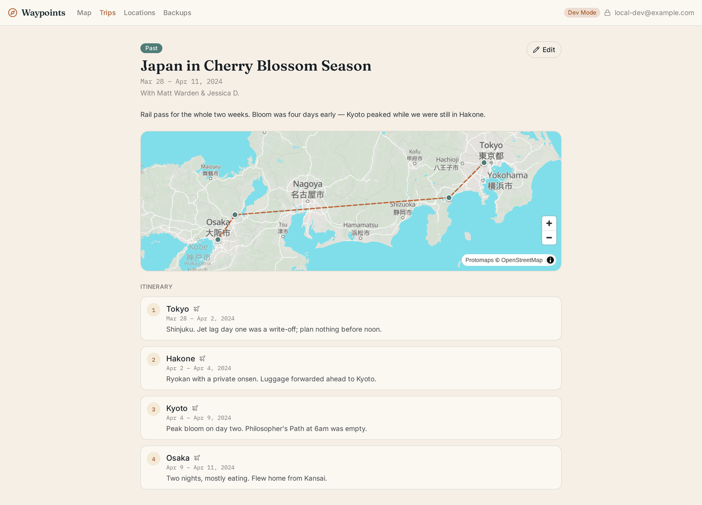
A trip page draws its route on a mini-map, then lists the itinerary in order with each stop’s own dates and notes.
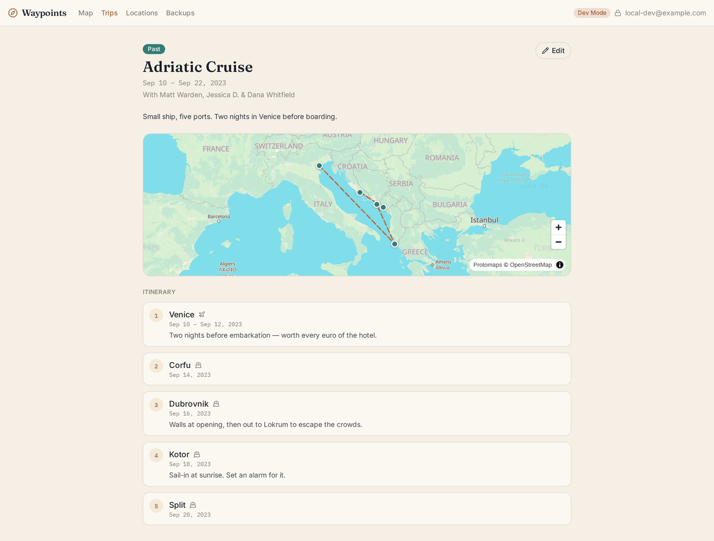
A few details compressed into one screen: a stop can override how it was visited (Venice was a hotel stay before boarding, so it gets the plane rather than the ship), single-day port calls collapse to one date instead of a range, and a friend who came along shows up as a traveler without ever having an account.
Editing is where the interesting decisions live. Stop dates that fall outside the trip’s own date range are warned about but allowed; planning is fluid, and a flight can legitimately be booked before the trip dates settle. Removing a stop asks for confirmation and names exactly what’s about to be discarded with it, because there’s no undo. And if a save fails because the connection dropped rather than because the input was wrong, the form and everything typed into it stay on screen with a retry message instead of being replaced by an error page. Notes get written on a phone, mid-trip, on bad wifi; losing a paragraph to a failed request is not an acceptable outcome.
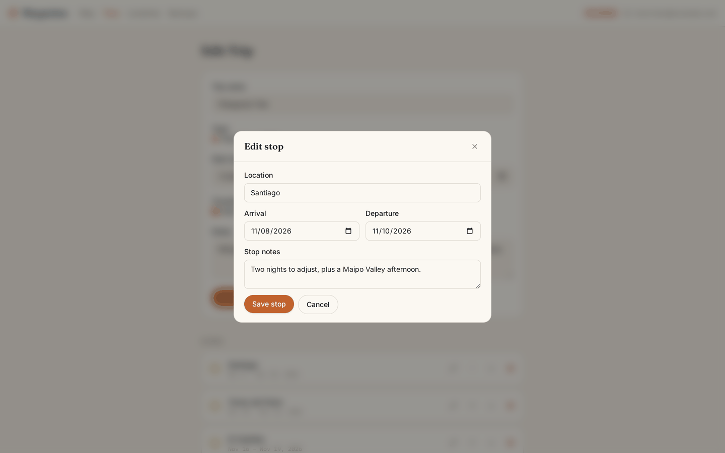
Each stop has a pencil that opens a pre-filled “Edit stop” dialog; saving updates it in place without disturbing its position in the itinerary.
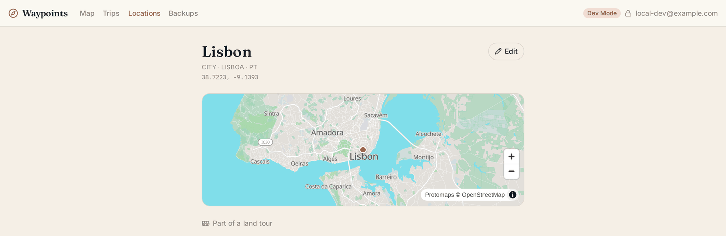
Locations have their own version of the same instinct. A location that’s a stop on any trip can’t be deleted. The delete control is replaced by an explanation naming the trips holding it, which is a permanent constraint, not a transient failure, and is never presented as something to retry.
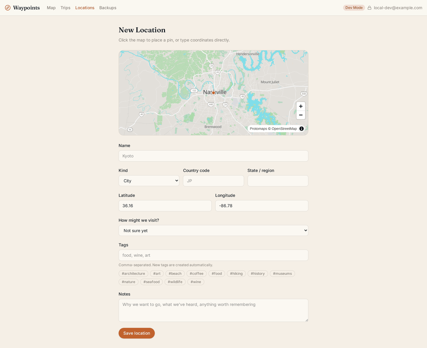
Adding a location: click the map to place the pin (or type coordinates), and pick from the tags that already exist rather than inventing wine, wine-tasting, and Wine tasting over three separate sittings. Typing a place name also autocompletes against a public OpenStreetMap search service, and if that service is slow or gone, the form quietly degrades to plain manual entry.
The stack, and why
React Router v7 running as a Cloudflare Worker, with D1 (SQLite) for data and R2 for object storage. No ORM; the data layer is hand-written prepared statements, because every statement is a network round trip and it’s worth seeing them. Zod validates every form submission before anything touches the database. Cloudflare Access with Google SSO sits in front of the whole thing; there is no login screen in the app itself.
The map is MapLibre GL against a self-hosted Protomaps basemap: a single multi-gigabyte .pmtiles file in R2, served over HTTP range requests. That’s the one piece of infrastructure I’d call unusual, and it’s there for the same reason as the JSON exports: no per-tile pricing, no API key, no third-party map service whose free tier can change out from under a personal app. Same reasoning behind self-hosting the fonts.
Visually it’s aiming at an upscale travel journal rather than a SaaS dashboard: warm sand and cream surfaces, a terracotta/teal accent pair that carries the planned/past distinction everywhere it appears, Fraunces for headings, Inter for text, and a monospace face for dates and coordinates.
The build itself was done with Claude Code, a good fit for a project where a written specification was going to be the source of truth regardless of who or what was doing the typing.
Where it runs
Behind Cloudflare Access on a private domain, for exactly two accounts. There’s no public URL to link to, and no demo. A travel tracker with two users’ actual travel in it isn’t something to open up.
The screenshots on this page come from a local development build populated with fictional trips and locations, not our real data.