Well Spent
Live siteA retirement projection tool built around the failure nobody models: spending too little, for too long, because of a fear that was never justified.
The argument
The average person dies with roughly the net worth they had at fifty. Almost nobody plans that.
It is worth sitting with what that sentence describes. Every year someone works but doesn’t spend what they earned that year, they worked and someone else was eventually paid for it. Sometimes that is intended, and a chosen gift to your children or to a cause is a good thing. But most of this money was never chosen. It accumulated because a plan was tuned for a disaster that never arrived and nobody re-tuned it afterwards, and the person paid for that tuning with years they cannot get back.
That is the asymmetry the whole site turns on. Overspend a little and you take less next year; money is fungible and the balance recovers. Underspend and the years the money was standing in for are simply gone, and no amount of the protected balance buys one back. Almost every retirement tool is built as though the two errors were symmetrical.
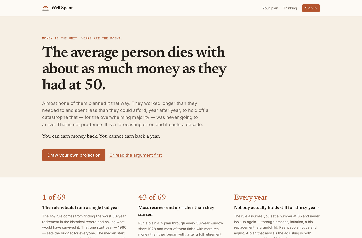
The home page states the case before offering the calculator, because the calculator only makes sense once you accept that underspending is a failure mode at all.
A necessary caveat, stated here and repeated in the app itself: Well Spent is a projection tool, not financial advice. It does not know about your taxes, your pension, your house, your health, or anything else about you. Nobody should make a spending decision on the strength of one model, this one included.
What it does differently
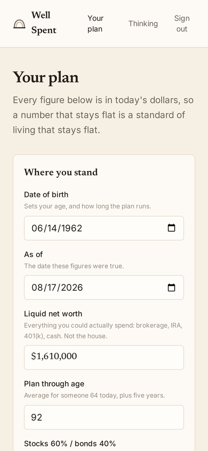
Give it a birth date, a liquid balance, a stock and bond split, and a date, and it projects a cone of uncertainty forward from real market history. Three choices in that output are deliberate departures from how these tools normally work.
The headline is not a probability of success. “94% success” collapses a whole spectrum into pass or fail, and because failure sounds catastrophic, it reliably pushes people to spend less. Depletion risk is still shown, plainly and without euphemism. It just isn’t the lede. The lede is what this portfolio and these settings can actually support, and how far below it you are choosing to live.
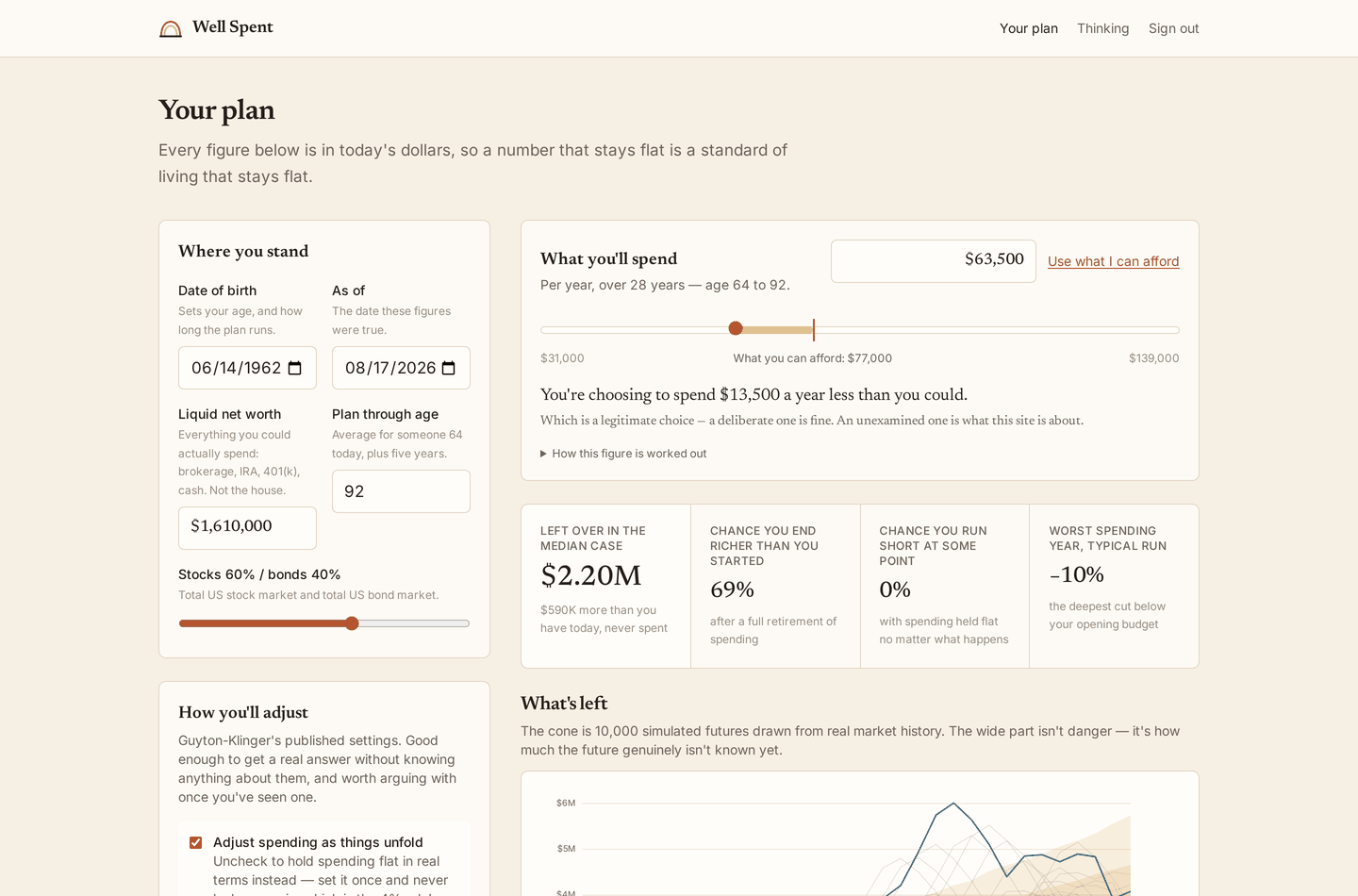
The budget is a slider above the analysis rather than a field in the sidebar, with the affordable figure marked on its track. Moving the budget doesn’t move the marker (what a plan can sustain is computed by searching over spending levels, so it doesn’t depend on the budget you picked), which means the handle slides against a fixed reference and the gap is legible at a glance. Here the model says $77,000; the plan says $63,500.
Survival is never shown without the spending path. Guardrails let a plan survive even the 1966 cohort, but it gets there by cutting real spending roughly two thirds at the worst point. A plan that survives by starving you has not survived. So there are two charts, the same size, sharing an x axis, and the second one is not optional.
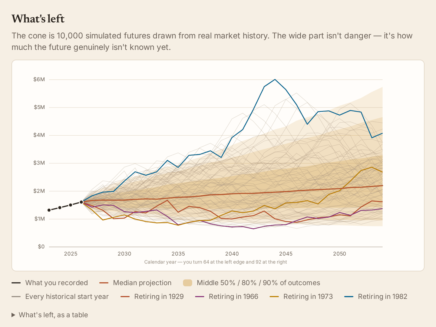
What’s left. The cone is a stationary bootstrap over the historical record, 10,000 paths, with blocks rather than independent years because retirements are destroyed by runs of bad years and not by their average.
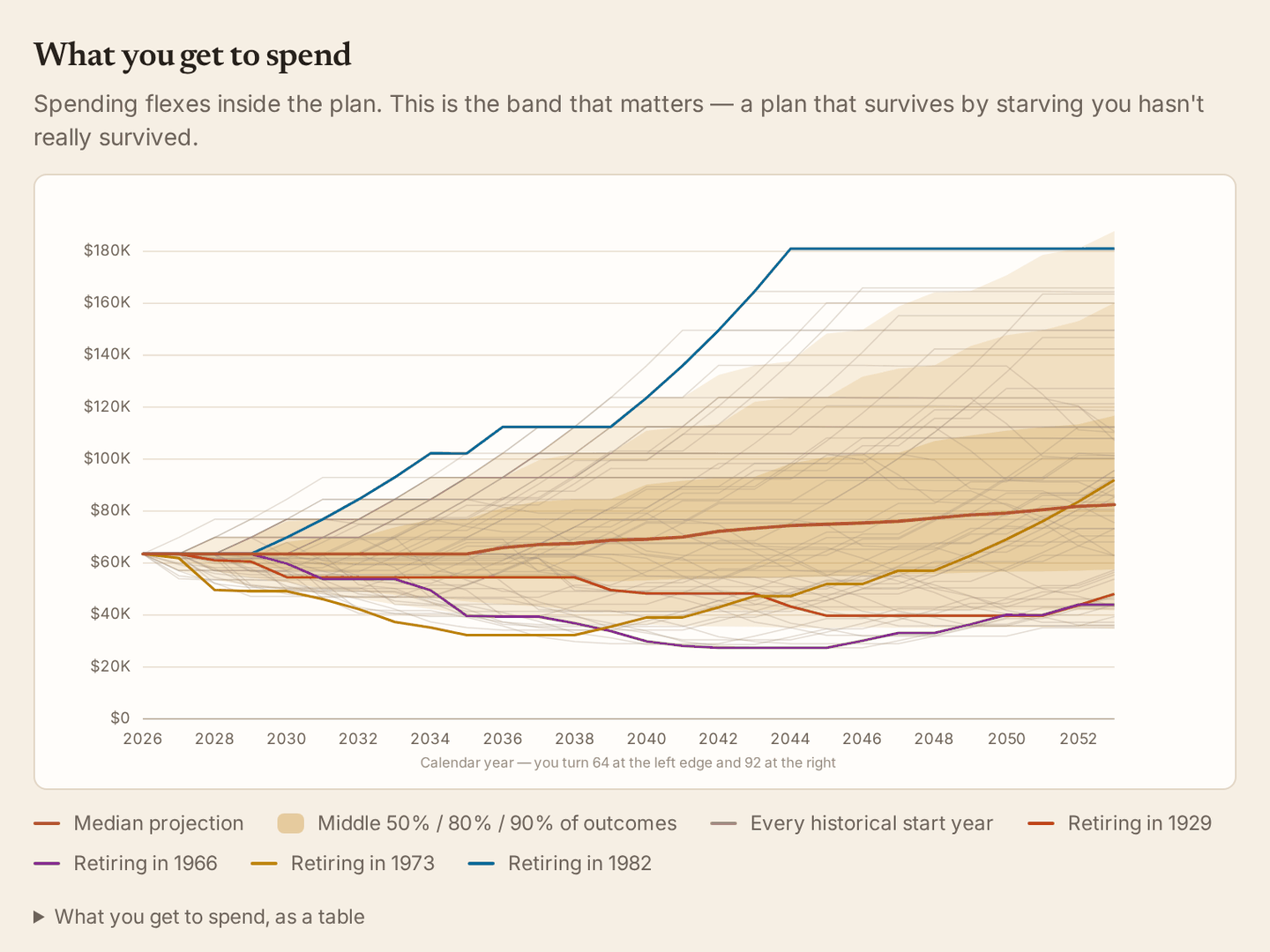
What you get to spend. Same size, directly underneath, never merged into the first chart on a second y axis.
The uncertainty cone is amber, not red. Red is spent on almost nothing in this interface; it is reserved for a genuine guardrail breach. Coloring the wide part of a projection red teaches the reader that uncertainty is a hazard, when it is just the honest width of a future nobody knows yet. Most retirement tools look like the spreadsheet they are (gray grid, blue chrome, red downside, a success gauge in the corner), and that styling is not neutral: it frames a life decision as an engineering problem with a pass/fail answer.
The argument it is willing to lose
The decision rules default to Guyton-Klinger guardrails, meaning spending flexes as things unfold, because real people flex. They can also be switched off, which produces flat real spending forever, the assumption underneath the 4% rule.
That toggle has to stay, because it is the thing the site argues with, and an argument you cannot display is a slogan.
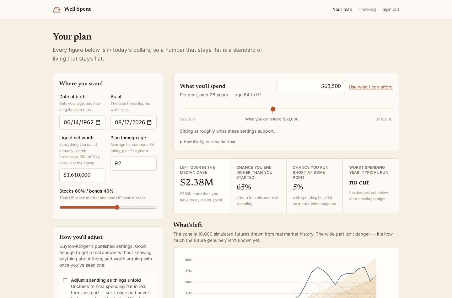
The same person, same balance, flexibility switched off. What they can afford falls from $77,000 to $63,000, and the chance of running short rises from zero to five percent. The tradeoff guardrails make is visible rather than asserted: they don’t delete risk, they change the currency it is paid in, from a small chance of catastrophe to a larger chance of a real and occasionally severe cut.
The affordable figure itself comes from a search with two conditions, both of which must hold: no more than 5% of simulated futures run out of money, and in the worst tenth of futures, average real spending across the whole retirement stays at or above 70% of the opening budget. That second condition is a lifetime average rather than a worst single year, and the difference matters. The obvious metric (the deepest dip spending ever takes) is a maximum over decades, so it saturates; searching against it drove the answer down to an absurd 2.3% and made flexibility look worse than rigidity. A transient dip that recovers is not what anyone means by an unaffordable retirement. A decade below plan is.
The feature accounts exist for
The calculator works fully signed out. Signing in is what makes it remember, and remembering is where the tool stops being a calculator.
You record where you stand whenever you like. Each entry turns a year that was a projection into a year that is a fact, and the cone is redrawn from that newer, shorter, better-informed present. A projection made once at 62 gets staler every year; the same projection re-anchored each January gets better.
Each snapshot also freezes the figure the model gave at the time, beside the figure you chose to spend. Tracked across snapshots, the gap between those two lines is the diagnosis.
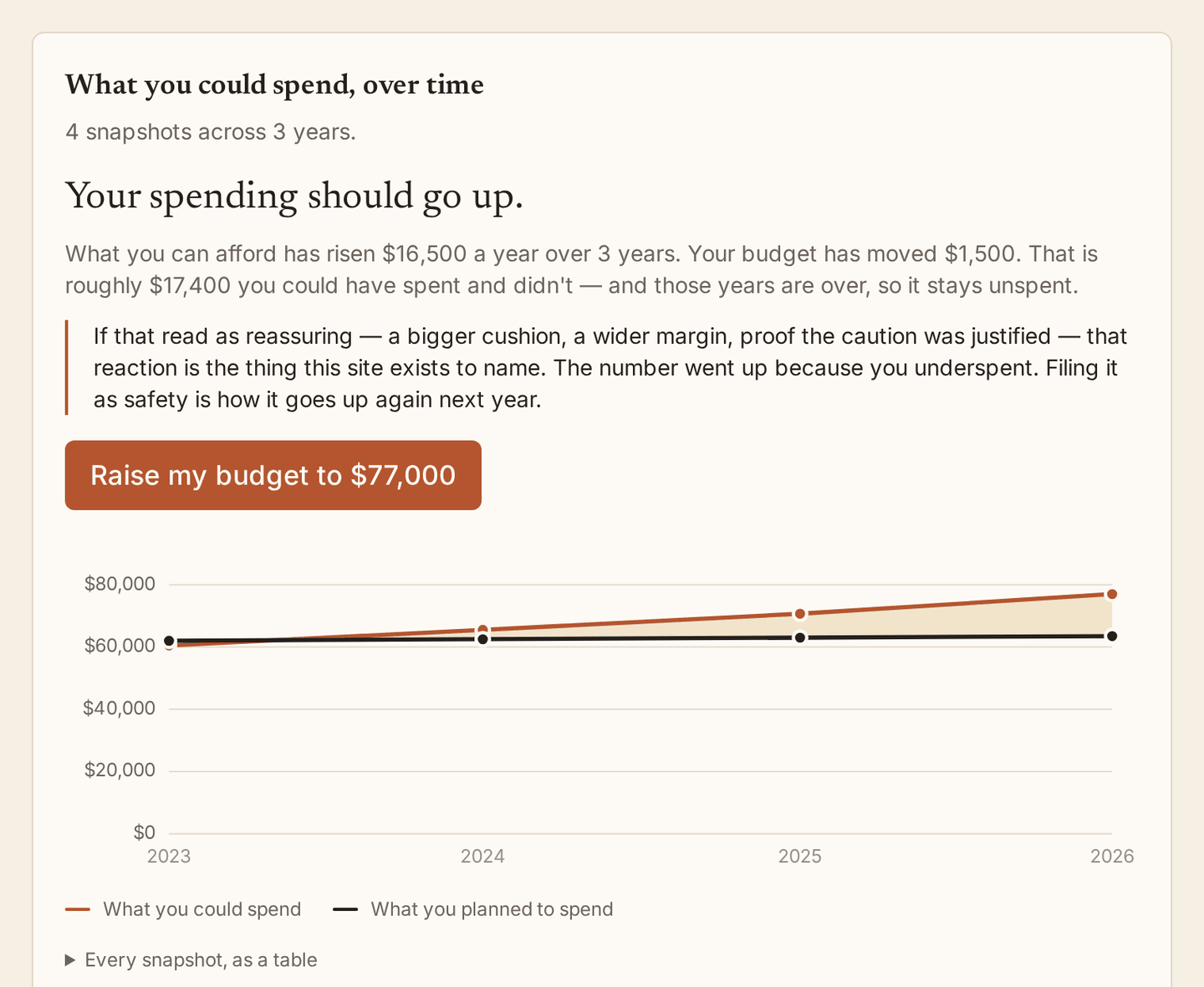
This is the whole point of the app, and it needs no data the user wasn’t already providing. Note that the readout is an instruction rather than an observation. Shown to the sort of person who reads a retirement site, a rising affordable figure reliably gets reinterpreted as reassurance (a wider margin, proof the caution was right), which produces more of the underspending it is evidence of. So the headline gives an instruction, the detail prices the delay in dollars already forgone, a third line names the misreading out loud before the reader can settle into it, and there is a button that applies the correction.
It reads in both directions. A sustainable figure falling steadily toward the budget is a real warning, and the app says so plainly, even though it is mostly built for the opposite problem.
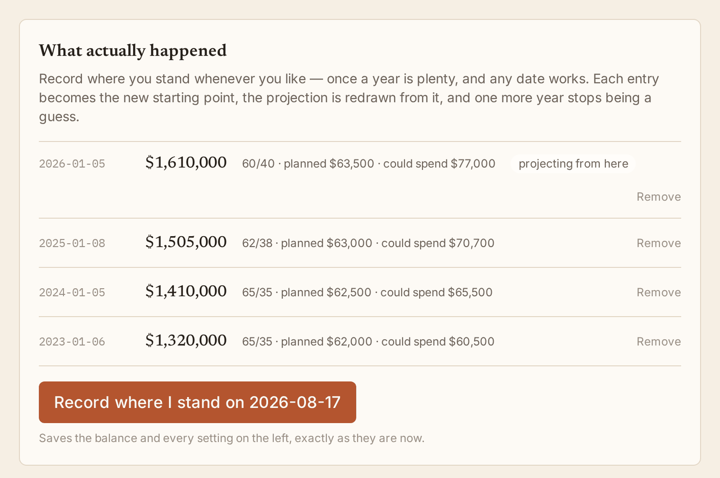
A snapshot is not just a balance; it is a complete statement of where someone stood and what they decided on a date, including allocation, horizon, and decision rules. All of those move over a retirement, which is why there is no separate “plan” record and why creating the first snapshot and the tenth are the same operation.
The model, and where it is wrong
Two ways of generating futures. The cone is the bootstrap described above. The overlay runs the same plan through every complete real start year with returns in their true order, naming five cohorts: 1929, 1966, 1973, 1982, and 2000. The good case is named on purpose, because a chart that only names disasters teaches the wrong lesson.
Returns come from Damodaran’s S&P 500 series including dividends back to 1928, a bond sleeve blended to about six years of duration to match a total bond fund, and December-over-December CPI, because the return series is measured year-end to year-end and an annual-average deflator would misalign by six months in exactly the high-inflation years that matter most. The horizon runs to remaining life expectancy at your current age plus five years, from the SSA period life table with sexes averaged; conditional on your current age, not at birth, since the at-birth figure is dragged down by deaths you have already survived past.
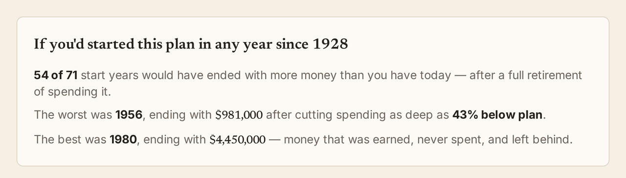
What that model produces, for a 30-year horizon at 60/40 with flat spending: the worst start year is 1966 at 3.80%, the median cohort is around 6.5%, a flat 4% plan fails 4 of 69 complete cohorts, and 43 of 69 end with more real money than they started with. These are pinned by tests, so a bad data regeneration fails loudly instead of quietly changing everyone’s numbers.
Bengen’s famous 4.15% comes out as 3.80% here, and the gap is not a bug: his bond sleeve was a different index. Same question, different data, a third of a percentage point of disagreement. That is itself one of the site’s claims. The famous number is an artifact of a data choice rather than a constant of nature.
Where the model is wrong is stated inside the app, on its own page, not buried in a footer. No taxes. No Social Security, pension, annuity, or part-time income. No house. No long-term care. US data only, two asset classes, Treasury-flavored bonds, flat real spending across a lifespan that in reality slows down, and a century of history that amounts to roughly three independent 30-year retirements, drawn from the winning economy of that century. Most of those omissions would raise the sustainable figure if corrected; taxes is the one large omission pushing the other way. None of it adds up to advice, and the site does not pretend otherwise.
How it’s built
React Router v7 on Cloudflare Workers with D1 for storage, Tailwind, hand-written SQL, and Zod on every action.
The interesting constraint is that the simulation does not run on the server. The Workers free plan allows 10ms of CPU per request, and 10,000 paths over a forty-year horizon is a few hundred milliseconds of straight-line arithmetic, two orders of magnitude past the budget. So the model runs in the browser in a Web Worker, which turned out to be the better design anyway: dragging the allocation slider re-runs everything with no round trip, and your balance never leaves your machine to be simulated. The Cloudflare Worker stays deliberately thin, serving documents, handling OAuth, and reading and writing D1.
The charts are hand-drawn SVG with no charting dependency, which is what made the design rules enforceable: percentile bands as one hue with opacity carrying likelihood, the money axis anchored at zero, a legend always present, and a table view of every chart, since color and position are otherwise the only encodings. Money is set in the serif rather than the mono, because a number in a monospace face reads as a spreadsheet cell while the same number in a book face reads as a sentence about your life.
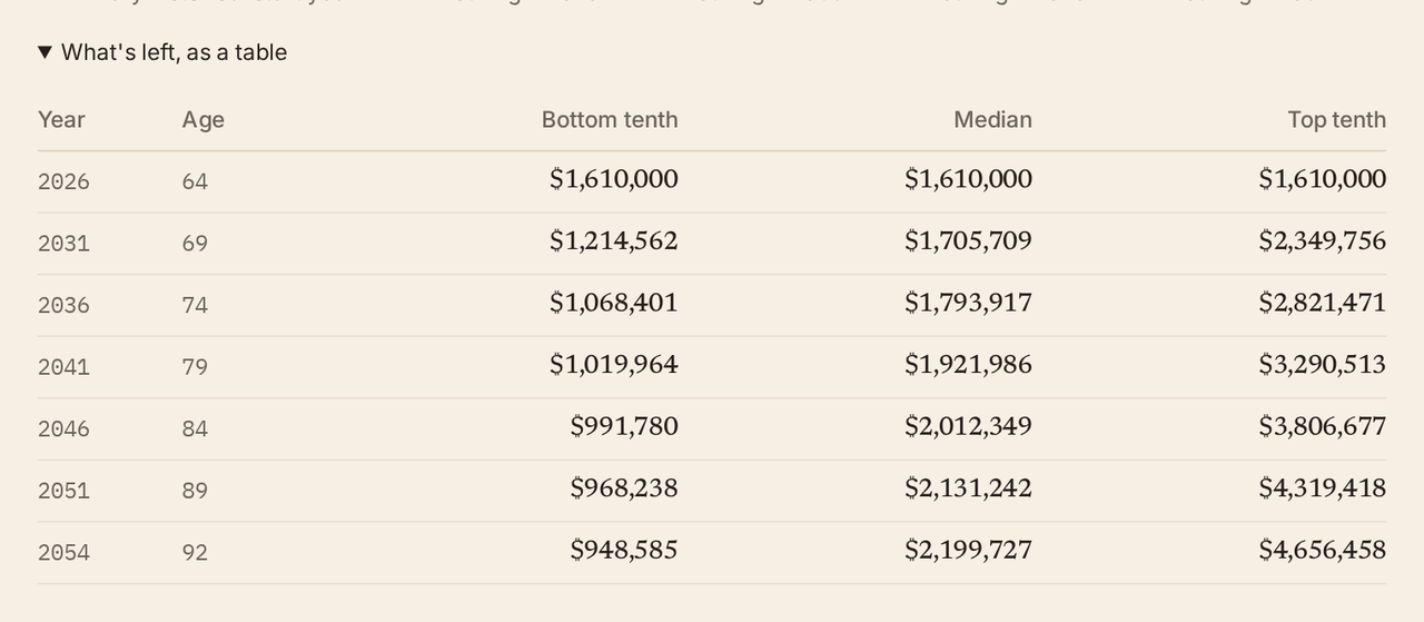
Every chart has one of these. Not a concession; a chart with no table is a chart some readers cannot use at all.
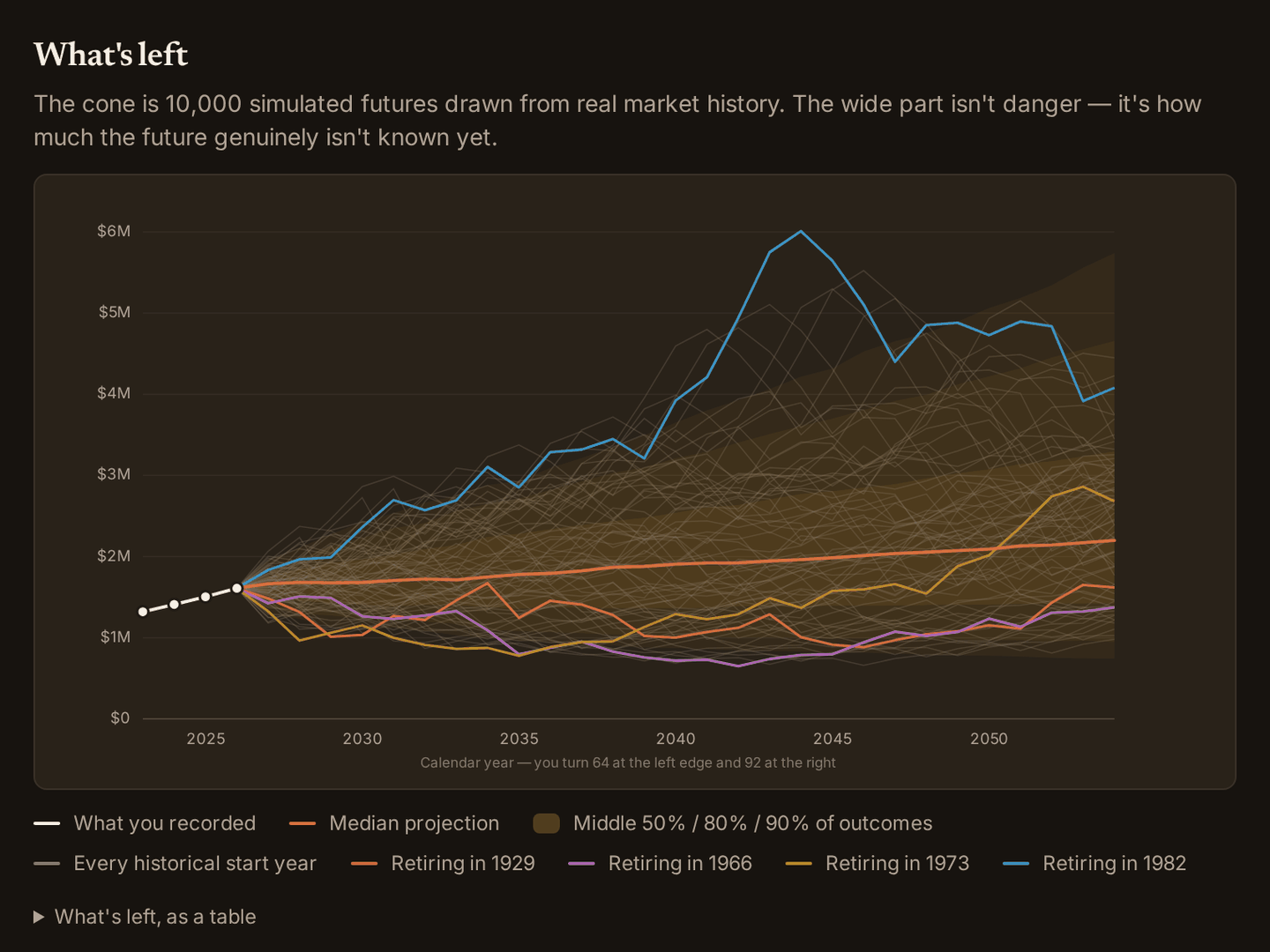
Cone opacities are theme tokens rather than constants: the same 20% amber that reads as a soft wash on paper reads as a solid slab on a dark ground. The five cohort hues were validated for lightness, chroma, color-vision separation, and contrast in both themes.
Sign-in is Google OAuth with PKCE, hand-rolled against the Worker runtime. Sessions are an opaque random id in an HttpOnly cookie with the state in D1, deliberately not a JWT, because a token you cannot revoke is the wrong shape for an app holding someone’s net worth. Users are keyed on Google’s subject identifier and never on email, since emails change.
Like the travel tracker, it was built with Claude Code against a written specification that is kept current as a rule, on the theory that the argument is the durable part and the framework is not.
Try it
The site is live at wellspentyears.com, and the calculator works without an account.
The screenshots here come from a local development build for a fictional person: 64 years old, retiring soon, comfortable, and spending about $13,500 a year less than her own plan supports. That gap is the ordinary case, not an extreme one, which is the reason the site exists. And once more, because it matters: this is a projection tool, not financial advice.